
When I was a child, I used to spend some time in the summers with my family at a lakeside cabin in the woods. It was a cozy little place, relatively isolated but homey. There was a HUGE picture window (terrific for viewing birds — and for watching squirrels steal bird food), an iron stove/fireplace, and host of other features that, taken altogether, made it a really terrific place to spend a quiet week or two fishing, boating, swimming, and generally relaxing and enjoying the outdoors.
It should come as a surprise to exactly no one who knows me to discover that, in the midst of all of that lovely nature, I spent a huge amount of my time there reading.
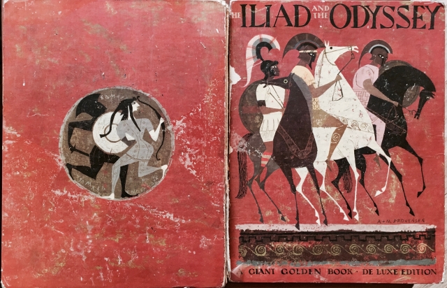
The (somewhat damaged) front and back cover of the 1956 Giant Golden Book Deluxe Edition of Jane Werner Watson’s adaptation/retelling of the Homeric epics, beautifully illustrated by Alice and Martin Provensen. I literally loved this book to pieces (note the absent spine and the peeling remains of the plastic film that used to protect the covers, much of which I peeled off myself).
There were a lot of books at the cabin, and I read as many of them as I could. Some, I probably should have skipped; I don’t think my pre-pubescent self was quite ready for Hotel or Jaws, for example, and some of the Leon Uris stuff was just beyond me. I adored the various wildlife guides, though — it was especially thrilling to actually spot a bird from the guide through the picture window. There was even a comic book or two (a horror anthology and, I dimly recall, an issue of Swamp Thing) stuffed in a drawer in one of the bedrooms.
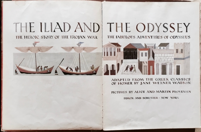
The title page of the Werner/Provensen Iliad and Odyssey. Note the lettering — the different colors of the letters accidentally provide the illusion that one is looking at something freshly inked onto the page by hand, rather than printed by a mechanical press.
There were two books, however, that I read obsessively every time I was there: a tattered illustrated paperback copy of Edith Hamilton’s Mythology and a gigantic children’s book retelling of the Homeric epics by long-time Golden Books author/editor/publisher Jane Werner Watson. I loved these books, both for the stories they told and (perhaps especially) for their illustrations. Often, having exhausted the text, I would leaf through the illustration and create my own stories to fit the images; as a horse-obsessed girl, for example, it was great fun for me to try to follow the tale of a single horse through the Iliad. There was always something rich and surreal for me about the experience of exploring the pictures and stories in my head. When the cabin was sold many years later, I was given the books to keep, and I still feel that story-magic when I look at them.
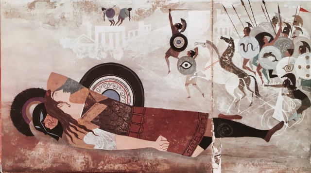
The Provensens’ rendering of Agamemnon, dreaming across the bottom half of pages 14 and 15. The careful use of shield motifs, armor colors, and helmet designs serves to individuate characters who would otherwise be indiscernible from each other in the highly stylized images. The spread of images across facing pages occurs frequently, and is often used to dramatic effect.
A large part of the magic in the Giant Golden Books edition of The Iliad and the Odyssey comes from the brilliant illustration work of Alice and Martin Provensen, an award-winning team of artists responsible for some of the most marvelous children’s book artwork you’ll ever see. They worked on some of the most memorable and charming of the Little Golden Books and other Golden Press publications for Simon & Schuster in the 1940s and 50s, as well as the Caldecott Award-winning The Glorious Flight (Viking) somewhat later (80s).*


So much is enchanting about the work the Provensens did on this book. They adapted the style of black-figure pottery painting — note the tendency to render bodies mostly in profile, without depth of perspective, etc. — to their own preferred color palette, using an ink-drawing-and-smudged-watercolor texture and typically angular 1940s-50s human figure design (entirely compatible with similarly angular black-figure design). While those firmly steeped in Homeric tradition might take issue with their choices about who gets drawn with a beard and who doesn’t at various points in this book, the images themselves are invariably powerful and often moving. They spread images across facing pages to create a sense of immersion and energetic motion. The images just above this paragraph, for example, are taken from the bottom left side of p. 42 and the bottom right side of p. 43, while the top of both pages is a single image of people watching from the walls of Troy as Achilles (left) pursues Hector (right). The details make all the difference — consider, for example, the angle of lean on both figures, so that Achilles and Hector are perfectly matched across opposite corners of facing pages in such a way as to suggest a common speed. None of Achilles’ face except his eye and part of his nose is visible under the solid black of his helmet, lending him an implacable menace quite absent from Hector (whose slightly visible chin and mouth allow the reader to “hear” him calling back to his pursuer, and whose visible eyebrow softens his eye).
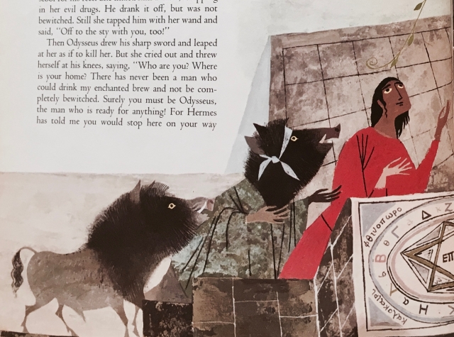
Odysseus’ crew in the process of being transformed into swine by Circe, bottom left side of p. 64.
Perhaps due to their early work in animation (Martin worked for Disney; Alice worked for Walter Lantz), the Provensens had a terrific sense of how to make even a still image present motion and change. Notice, in the illustration above of the transformation of Odysseus’ crew into swine, how they’ve used position (the stepped heights), figure details (one man still human, one in between, and one pig) and little color details (the yellow eyes on all three figures) to represent the change in progress.
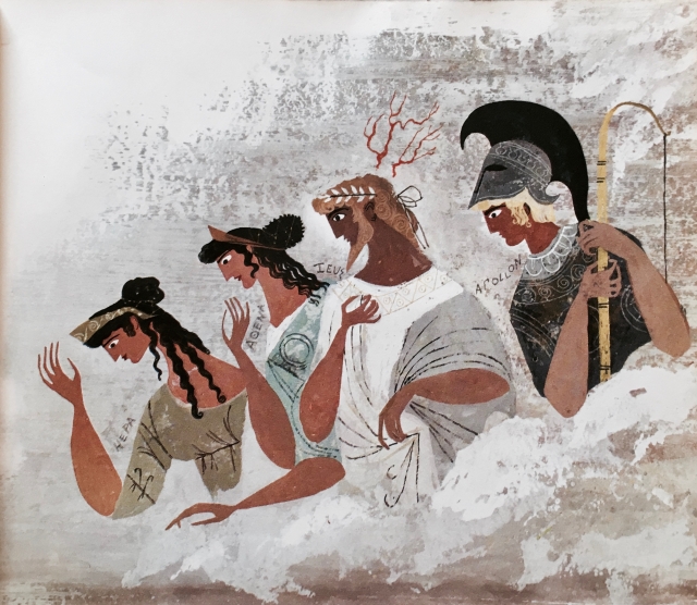
The gods look down on the duel between Menelaus and Paris (p. 19). Note the Greek(ish) names of the deities. The book is filled with small, odd bits of Greek, some of which are more or less correct, and some of which appear to be simply nonsensical. There does appear to have been an effort made in the text and illustrations, however, to imitate ancient usage in ways that could be made recognizable to a contemporary English speaker familiar (at least in broad strokes) with the story and the characters.
It’s really a beautiful book, and I really regret how I contributed to damaging it through hard wear and use when I was a child. The Giant Golden Book edition of The Iliad and the Odyssey has been out of print for years, and while used editions are out there, it’s not easy to replace; while badly damaged versions like mine can be found for less than $20, early editions in collectible or like-new condition can run well over $200. One of the many things on my “to do someday when I have the chance” list is to have the spine and damaged pages repaired, mostly to protect it from further damage — it’s never going to be a collectible, but it will always be loved.
* For a taste of the scope of their career together (as well as a peek at Alice’s solo efforts), take a look at this video of an exhibition of their work from the National Center for Children’s Illustrated Literature (NCCIL):

")
")


